iomando 2.0 — Behind the Scenes
Introducing iomando 2.0, the product story behind its three most prominent and challenging features.
ℹ️ This post was originally published in May 2013 on the official iomando blog and it dove deeper into the product story behind its three most prominent features.
This announcement also came accompanied by two complimentary updates:
- iomando 2.0
- iomando 2.0 — Hardware Update: a hardware-focused release notes.
- iomando 2.0 — Behind The Scenes: the product story behind some of the new features.
Across all three you’ll find many insights around the design process and the challenges we faced developing the product from many perspectives.
Now, to the update.
Last month we introduced iomando 2.0 — an entirely new version of our product, both on the software and hardware end.
Since the rollout, we’ve been receiving a ton of feedback and curiously, a lot of people reached out asking why we had taken certain (product) decisions. We thought this was a great opportunity to expose the reasoning behind some of them.
Unfortunately, we can’t cover all the features released alongside iomando 2.0, because there were a lot of them. Remember, the new UI, the passwordless login, support for up to four doors from the same space, geolocation enhancements, new management tools, passcode lock, plus, all the hardware-related improvements.
A walk through all of them would take longer than a single post. Instead, we can focus on the three that we’ve sweated the most — and also the ones that we’ve been asked the most 👇
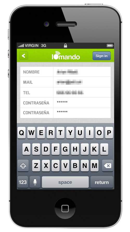
- Passwordless (SMS) login
- Passcode lock
- Location services
Passwordless (SMS) Login
We’ve been struggling with logins and accounts since the very first day.
For a moment, think of the boundary conditions and what the user is trying to accomplish when she downloads the app. iomando is not a place we expect to spend a lot of time, we are not a social network, we are a tool that provides a solution to a given problem.
We aim to solve a concrete situation for our users by being a better alternative for keys and remotes. We spare the user the bulk of carrying around her keys, which is great, but sadly, not enough. As it happens the solution also involves the creation of a delightful experience, faster, to the point.
Passwords and logins are painful because they create friction, thus slowing everything down. This is not something we came up with, it is a widely shared opinion, to say the least.
But we don’t like slow, we like fast. Remember, iomando needs to be fast. Yet it also needs to be secure. The password friction is then a necessary evil, the price we must pay to ensure our spaces remain secure enough.
It is a high price, though.
Our users don’t want to remember yet another password. We spend more customer support time than we wanted to solve password-related issues. On top of that, user data is of no value for us. Our business doesn’t “resell” user data to third parties nor we plan to do anything with the data we are collecting beyond improving our own product.
We reached a point where we wondered if “there was a better way”. We grab a whiteboard and ask ourselves: “if we were to build this again, how the best login system should look like”.
Then we identified three main characteristics:
- Frictionless from the user point of view.
- Private, yet manageable by the administrator — so she knows who is letting in.
- Extremely secure.
The credentials had to be durable, reliable and unique to the person, but also easily verifiable and overall, something the user feels comfortable sharing. For example, a DNI excels at these three features, but its verifying process is slow and also is not something the user would be comfortable sharing.
After running over some ideas and surveying our user base, we agreed that phone number was the only one checking all requisites.
An email was also a final contender. It is public and easily verifiable but was not unique nor durable. I can think of people with more than three emails and also people who often change jobs and gets a new address each time.
The phone number is an identifier that is associated with you for a longer period of time — I have the same since I was 14. Thus an administrator is more likely to target someone by her phone number rather than one of her multiple email accounts.
It seemed phone number checked the “manageability” checkboxes, but we had yet to account for friction and security.
Curiously enough, it is widely accepted in the “security parlance” that these two characteristics are always a tradeoff, you can’t have it both ways. We thought like that, too.
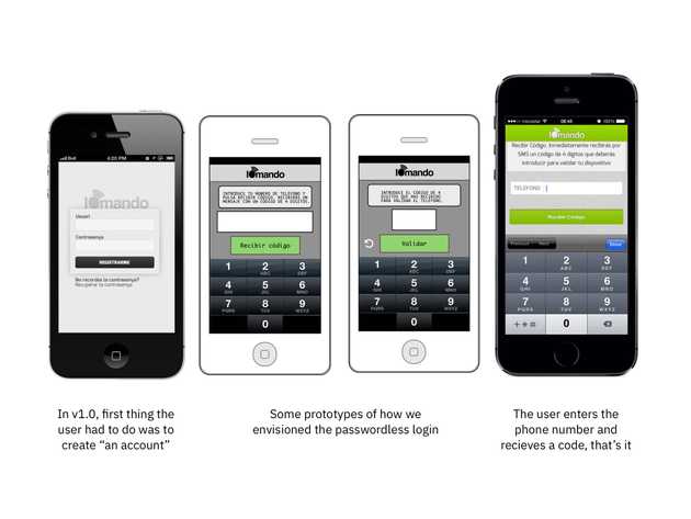
In our ideal world, the user logged in once and she wouldn’t need a password again. But then, how you were reassured that she was who claimed to be in each future login? This was our main struggle. We knew we wanted something passwordless, but didn’t know how to make it work in order to ensure security in each subsequent login.
Meet the verification code.
When we tried to distill what security meant for iomando, we thought of a piece of information only the user knew (and remembered), but also something third parties wouldn’t have access to.
Eventually, we came up with the realization that flipped our previous assumption on its head: it wasn’t necessary to think of the “secure element” as something the user knew when it could be something the user had.
This small twist changes the entire mechanics of the problem. Because once you acknowledge that the “key” is something the user “has” remembering is then out of the picture. You just solved for friction. From here, the only thing you need to do is to bound this “key” with something unique, which we already had as we mentioned above: a unique, public and verifiable identifier the user had all the time 👉 the phone number.
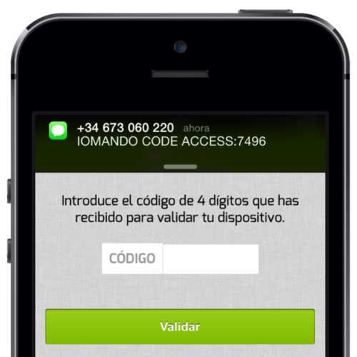
If we could verify the phone number (which we did by sending an SMS with a code to the number the user provided) we could assure that the user was telling us the truth, therefore, we could tie together user identity to her phone number, forever, no further login or password required.
The user “had” the code, she demonstrated it by typing it in, that’s everything we would ever need to check for in order to ensure the user had the phone number she claimed.
Passcode Lock
Needless to say, also piggybacking on the first feature, security is a concern that runs deep at iomando. Paradoxically, while a passwordless login makes the initial pairing and authentication more secure than it ever was, it also makes it easier to access the app once the authentication has been validated.
This is not a unique trait of iomando. All apps assume a certain security threshold will be ensured behind the lock screen — that’s the reason why we don’t endlessly login again and again to each app every single time we launch them.
But we acknowledge iomando is an edge case, an outlier in security terms. We deal with access control and we truly understand the responsibility that comes along with that.
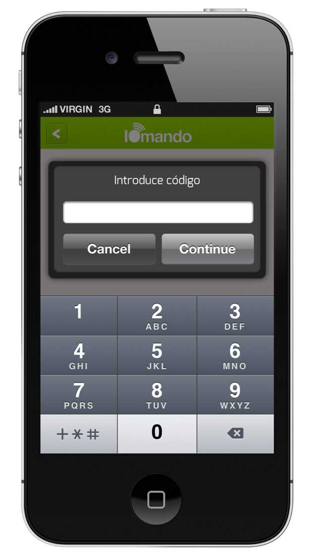
Then coming hand in hand with the passwordless login, one of the features we’ve introduced with iomando 2.0 is the ability (disabled by default) for the user to set a four-digit passcode that will be prompted every time the open button is tapped.
While developing the feature, we acknowledged we were messing up with one of our core values — i.e. speed in the execution. But on the other hand, it was also true that security, at this stage, was a far more critical concern, something we rather had to address sooner than later.
In iomando parlance, security trumps everything.
Yet in order to minimize the drag produced every time the open button is tapped, we’ve improved the password input speed by automatically showing the numeric keyboard1. Despite we understand some smoothness was lost in the process, the feature will be candidly remembered in cases such as a phone gone missing — i.e. stolen or lost. Surprisingly, even some users reported early feedback of how the feature helped them prevent a door to open because of an unintended touch.
This is an interesting point. Since iomando may or may not be distance constrained (see next point), an unintended touch could be potentially disastrous. With a passcode lock, every time the button is (accidentally or not) tapped a passcode is prompted. The next time your kids are inevitably driven by the temptation to push the big green button, your access will remain safe.
Geolocation
One of the (many) side benefits of rebuilding the apps from the ground up to be fully native to each platform, was the ability to take advantage of the geolocation capabilities of the devices — both on Android and iOS.
Getting to know the user position in real time opened a whole world of possibilities when it came to managing user access from an admin point of view.
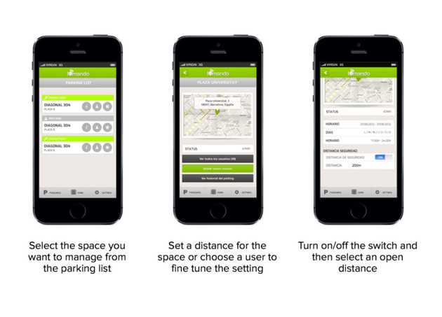
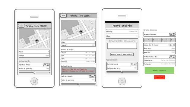
Since iomando is distance-agnostic when it comes to fulfilling accesses requests, the most straight-forward and obvious geolocation-related feature was to create a geofence around an access point.
In plain English, this simply means we draw a circle around an access with a certain radius — this is a distance set by an admin, which determines whether you are allowed to access or not. Then every time you tap the open button, the app will process your position, match it again the security radius, and decide — depending on whether you’re in or out of the circle — if you’re allowed to open.
The feature can be turned on either as a global setting, for the entire space, or in a per-user basis, assigning each user a determined distance that will override the global setting.
Restricting the geolocation can be helpful from a security point of view, but it can also be used to enhance convenience. We encourage users to set a reasonable distance — say 5km — in order to prevent unintended touches without the burden of having to set a passcode lock each time.
- The passcode has to be a four digit number. We thought of creating more complex patterns, but again, speed was then truly compromised and the security provided by a four-digit number was “good enough” for the problem we were trying to solve here.↩
