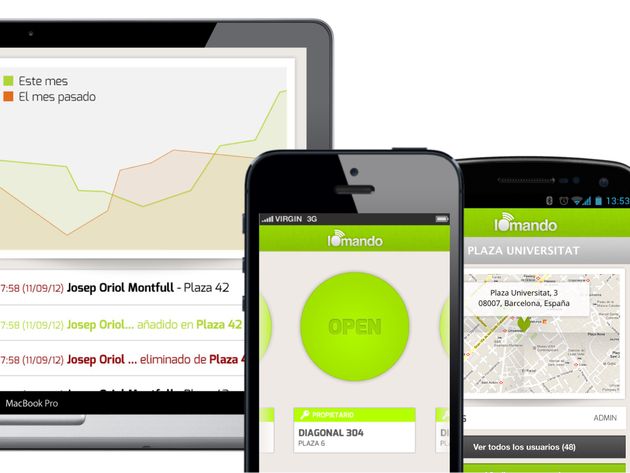
iomando 2.0
Introducing iomando 2.0, with a redesigned interface, passwordless login, support for multiple doors, location-based permissions and much more.
ℹ️ This post was originally published in April 2013 on the official iomando blog and it announced the release of the second version of the product.
This announcement also came accompanied by two complimentary updates:
- iomando 2.0
- iomando 2.0 — Hardware Update: a hardware-focused release notes.
- iomando 2.0 — Behind The Scenes: the product story behind some of the new features.
Across all three you’ll find many insights around the design process and the challenges we faced developing the product from many perspectives.
Now, to the update.
It’s been almost a year since we introduced iomando 1.0 and we couldn’t be happier because of the great reception it has had among our customers.
Last year [this is 2012] we’ve installed our service in more than three hundred spaces (ranging from parking, communities, buildings and small business) and recently crossed the 7.500 active users1 mark. But most important, our customers are delighted with the product and a lot of them have recommended it to their family and closest friends.
2012 has definitively been a good year for iomando and, among other things, here are a few highlights that sum it up:
- Closed our first seed round with local business angels and industry partners.
- Released iomando 1.1 last summer [again, this is 2012], which included many new features such as the possibility to manage users right from the mobile app or a faster door-opening engine — which reduced the opening time almost 80% and increase its security.
- Won the Barcelona Startup Network Smart Cities Edition.
- Learned a ton about subscription-based business models and made some adjustments to the the way iomando is distributed.
We have a lot to celebrate, but we wanted more. During the entire year, we’ve been working hard to bring the next generation of our product to the market. As a result, today we are rolling out a whole new set of mobile apps, administrator panel and electronics for the door.
Meet iomando 2.0, the most advanced keyless access system.
Before diving deeper into the details of the update, it is worth pointing out that this not only good news for new customers, but for our current user base, as well.
Because of our subscription model, they will benefit from all these new features without any additional cost, even the hardware will be gradually upgraded during the upcoming months.
Now that’s been cleared out of the way, let’s jump into the update.
Redesigned Interface
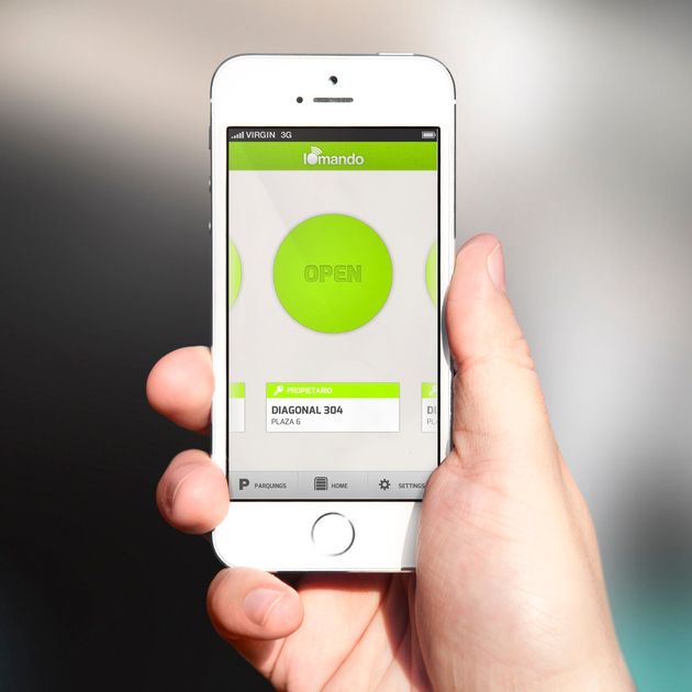
iomando 2.0 brings a completely redesigned UI and an array of new features: some following our roadmap, others — we didn’t plan for — as we encountered new problems our users revealed. The amount of unexpected things we have learned from our customer feedback has definitely surprised the whole team and we can’t wait to put this new version of iomando in the hands of our users.
iomando has moved away from “glossy” appearance and embraced current, flatter trends. Led by the industry movement towards flatter designs, the overall experience feels like it belongs to the medium again. The new colors stand out because of its elegant cues and a personality that makes iomando’s design truly unique.
Beyond the pure visual layer, we’ve also improved the responsiveness of the app, ditching our initial hybrid core and rebuilding it from the ground up, using native technologies. This makes the app feel more direct, both on Android and iOS, with plenty of richer interactions. Turning simple actions like swiping between spaces in the home screen, into a pure delight.
Finally, despite the navigation menu remains in the bottom, we moved the management system away from the center to improve clarity across the board.
Now the home screen is all about opening doors. We’ve removed the arrows on the corners and fully embraced the swipe gesture as the main interaction to navigate between them.
Passwordless Login
This is one of the most challenging features we have implemented so far, but also one that we hope our customers will love the most.
Here’s a fact: everybody hates username and passwords.
We have to remember dozens of them, repeat them across services, then forget them, and you know… 12345 is not always the safest combination for your accesses.
Fortunately, iomando 2.0 comes with a radically new approach to smoothly register and log in to the service.
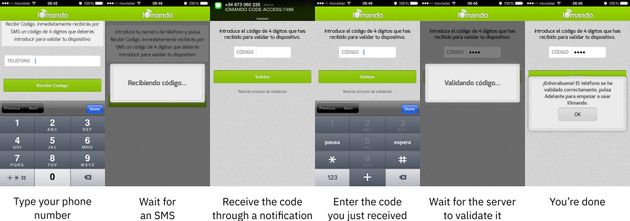
Instead of relying on usernames and passwords, we’ve implemented an SMS validation mechanism that sends a code to the user’s phone number the first time she opens the app. Once she has validated that the phone number actually belongs to the user, she’s already logged in.
Here’s how it works 👇
No usernames, no emails, no passwords, no nothing. Just type your phone number, enter the code, and you’re off the races.
Along the way, the time required to create an account has always been dramatically reduced. Most important, we just got rid of the possibility to forget your password, because there’s none.
The passwordless system has advantages for administrators, too.
Prior to iomando 2.0, the admin had to “guess” the user email in order to activate the user — since a person can have many emails that can change over time, but most certainly one phone number for the rest of her life.
With the passwordless system, the admin has a unique, unchanging identifier — the phone number — that can be used to assign permissions across the service.
Up To Four Accesses
This is kind of a big deal. One of the most demanded features, especially among household customers, was the ability to manage multiple accesses or doors on the same screen.
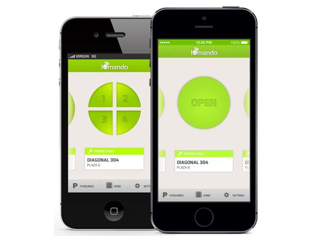
iomando 2.0 now supports up to four doors within the same space and screen.
Now when you configure your space you can set up to four doors 👇
This new feature also comes alongside the addition of the second relay to our electronic board. You can read more on the hardware update, but the gist of it is that prior to iomando 2.0, each access required an independent device. The new electronics though, now support multiple doors, making it easier to install, but also way more affordable since only a single device has to be installed.
Geolocation And Enhanced Management
One of the consequences of iomando being powered by cellular connectivity is its ability to open the door from, literally, anywhere in the world. Is not a matter of distance, if you have cell reception, you can issue an open command wherever you are.
This is clearly a double-edged sword. On one side, it is great for users to have this location constraint removed, but on the other, it has been a major security concern for space administrators.
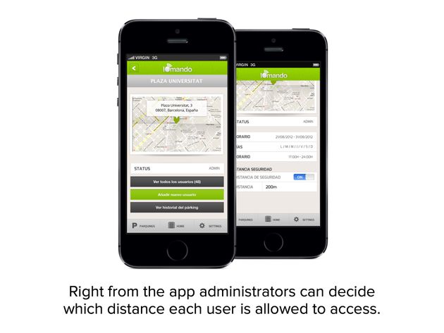
iomando 2.0 will start using geolocation services on the phone to determine if a user is close enough to a certain access, letting admins define a security radius outside of which the users won’t be able to use the service.
On top of that, there will also be more specific settings, so an admin will be able to fine-tune the feature and set the radius on a per-user basis.
iomando 2.0 also comes with the possibility to refine the management settings to a point where you can also set the time frames when the users will be allowed in. That means if you want someone to come in just for dinner, you can set him up for the night and the permission will expire as soon as he walks away from your home.
In addition to that, we are rolling out a web-based beta version of our management tool so you can access it from any computer. We want to provide the best experience when it comes to the administration, and we think the web is a big part of that. If you want to see what’s next while helping us improve the product, you are welcome at clients.iomando.com/beta.
But Wait, There’s More
- Passcode lock: set a 4 digit code to secure even more your accesses.
- Swipe to navigate: swipe between spaces if you happen to have more than one.
- Space insights (admins only): real-time updates and statistics about the people accessing your managed spaces.
- Parking list: redesigned parking list view, where you can get at a glance the status of all your accesses.
- Faster open under 2G connectivity: opening doors in harsh conditions, when 3G is not available, is up to 50% faster.
- Plus, it looks amazing in the new green iPhone 5C :)
We’ve been working on this update for almost an entire year. As always, we’ve poured a lot of care and effort building the new version of iomando. We couldn’t be more excited about putting this new iomando in your hands and we hope you will enjoy the experience as much as we did.
- We consider an active user someone who has downloaded the app, had permission in one or more space and opened the door at least once in the last month. For example, someone that has used the service once 2 months ago and hasn’t used it again, doesn’t count as an active user.↩

