From Mobile to Web App
At a time when the whole industry is gravitating towards mobile-first strategies, we have chosen a different path.
Last week, we introduced the iomando Dashboard v1.0. It represented a significant advancement over our mobile app in terms of management features, which our customers had been requesting. Since its release, we’ve received a wealth of feedback, mainly questioning our decision to move away from mobile.
It’s intriguing, isn’t it? At a time when the whole industry is gravitating towards mobile-first strategies, we’re moving in the opposite direction. Yes, this is a deliberate strategy, and I’ll explain why we believe it’s the right choice.
Background
iomando was launched back in 2012. Prior to that, we explored various approaches to build a business around the technology we had developed. Although we pivoted towards a more product-focused approach, our primary target remained residential and small community markets, where we saw potential for less friction and faster growth.
When iomando was initially launched, it was targeted at small homeowners who prioritized comfort and ease of use over a wide range of features.
After a year of solid sales but limited market traction, we faced challenges in finding our niche in the market. This led us to reevaluate our strategy completely. We pondered over our unique advantage that set us apart from our competitors.
Thus, we shifted our focus to larger organizations where access control was a critical issue, putting our technology to work in scenarios where it could truly make an impact and solve real problems. Since this pivot, we’ve experienced accelerated growth and have dedicated all our efforts to building an exceptional service that redefines access systems for the mobile era.
We realized that scalability was our key strength — the ability to add units of capacity at no additional cost was unique to our product. This was an area where our competitors couldn’t match us. However, we were serving a market that didn’t fully leverage this advantage. It was like having a superpower that we weren’t using.
With this necessary historical context, we can begin to understand why certain decisions were essential to meet the expectations of our new customer base. Here are the three main reasons we transitioned from a mobile platform to a web app.
Professional management
Originally, iomando was designed for small homeowners who valued convenience over a wide array of features. The management tasks required were minimal, typically involving initial family activation and occasional use for guests.
This scenario was ideal for a mobile-first management tool, reducing complexity and encapsulating the entire experience within a single app.
However, as we began catering to large spaces with thousands of users and extensive use of permission assignment features, our new professional customer base required more robust tools than what a mobile app could offer.
Access managers sought data visualization, advanced customization, CRM integration, bulk editing, import/export capabilities, and more. Although we considered developing a new mobile app solely for management, we ultimately chose a web app for these purposes (more on that later).
As our company and customers evolved, the tools we initially had were no longer sufficient. Our customers now prioritized features over convenience, and a web app was the best solution.
Mobile app focus
Initially, the ratio of users who were also customers (thus utilizing the management features of the mobile app) was approximately 1:10. However, this ratio has now shifted dramatically, coming closer to 1:100 and is still increasing rapidly. Consequently, it didn’t seem logical to overload the app with features that less than 1% of the user base was utilizing.
The second point revolves around ensuring clarity for mobile users. As the user base expanded, customer support received an increasing number of calls. Contrary to the ideal scenario where a great service runs smoothly leading to everlasting customer satisfaction, the reality proved to be quite different.
We were inundated with emails and calls from users seeking guidance and clarification, stretching our capacity to respond to everyone. This challenge further justified our decision to simplify the app, focusing on doing one thing exceptionally well. Striving for simplicity and effectiveness, detaching the management capabilities from the app provided us the perfect opportunity to achieve this goal.
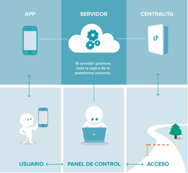
Our role evolved to resemble more of a web service provider than a mere end-client interface. Creating a distinct experience for the management tool allowed us to tailor and optimize both aspects (management and access) independently, addressing their inherently different requirements.
Evolving faster
The final reason for our transition to a web app was its inherent flexibility and the ability to rapidly iterate and customize the solution.
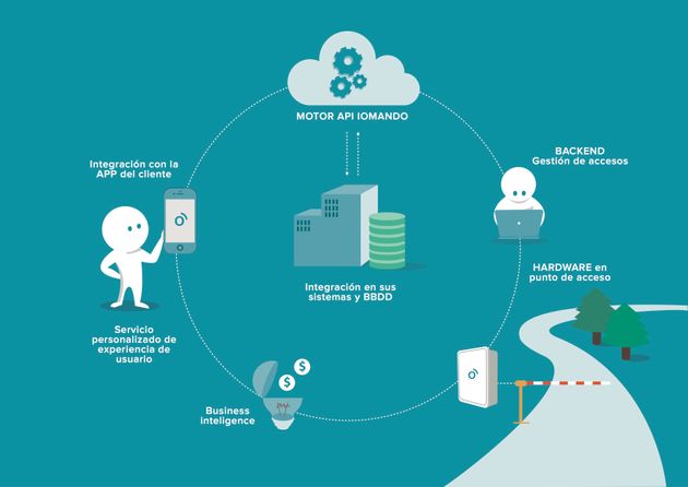
Our newer clientele, utilizing the management tool, expressed a desire for a more personalized experience, including adding their corporate branding and seamlessly integrating with third-party software they were already using. Our shift towards a more horizontal approach necessitated complete control over the solution. At times, we felt akin to a web service rather than just an end-client application, especially as we fully integrated with other applications serving as front-end interfaces for our clients.
This situation exemplifies the challenges I discussed in a previous article, where transitioning from a vertically integrated solution to a horizontal service provider led to less than ideal design choices, diminishing our overall value proposition.
In summary, the transition from a mobile to a web app was driven by multiple factors:
- A demand from customers for more sophisticated, professional tools.
- The need for independent optimization of distinct experiences (management and access).
- The requirement for a modular approach and comprehensive customization, which was more feasible with a web app.
- And, of course, the preference for a larger screen interface.

